The objective of this project was to explore issues of typographic structure and typographic composition through designing a poster that visually communicated the message, meaning, and essence for the RIT Performing Arts Department’s upcoming production of “Men on Boats.”

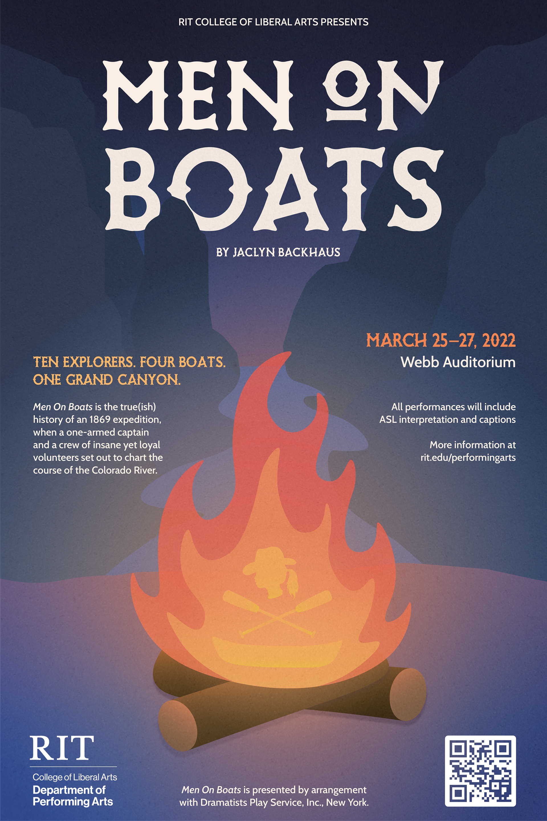
Jaclyn Backhaus’ Men on Boats tells the mostly true story of an 1869 expedition of ten men as they travel down the treacherous Colorado River. This poster showcases literal elements from the play—the fire, river, and rocky canyon—but also reveals a conceptual aspect of the story by having a silhouette of a woman’s head and paddles over a boat in the fire. The intention of this was to be reminiscent of a skull and crossbones, symbolizing a warning of death and danger. The inclusion of the woman’s image is alluding to the play’s cast portrayed by actors who are female-identifying, trans-identifying, genderfluid, and/or non-gender conforming, as intended by the playwright.
The poster’s design depicts a more simple and contemporary illustrative stylistic approach to juxtapose the traditional design one might observe in the time period of the play’s story. The vector graphics and heading typeface both have a roundness and curve to them, not only creating a sense of uniformity but also emulating the bends of the river.
ApplicationS of Design
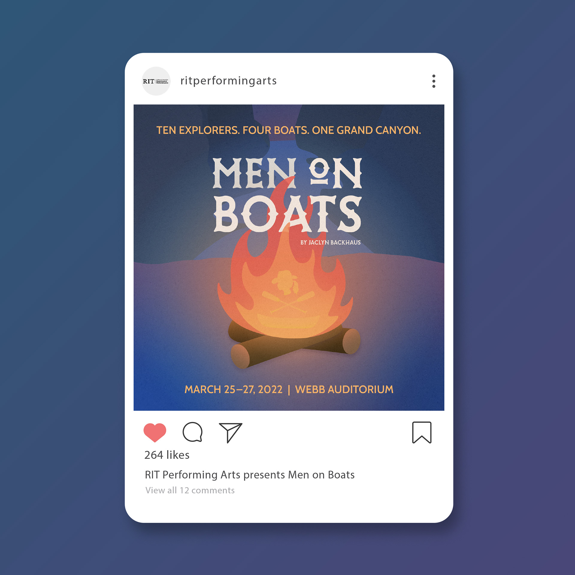
Social Media Post
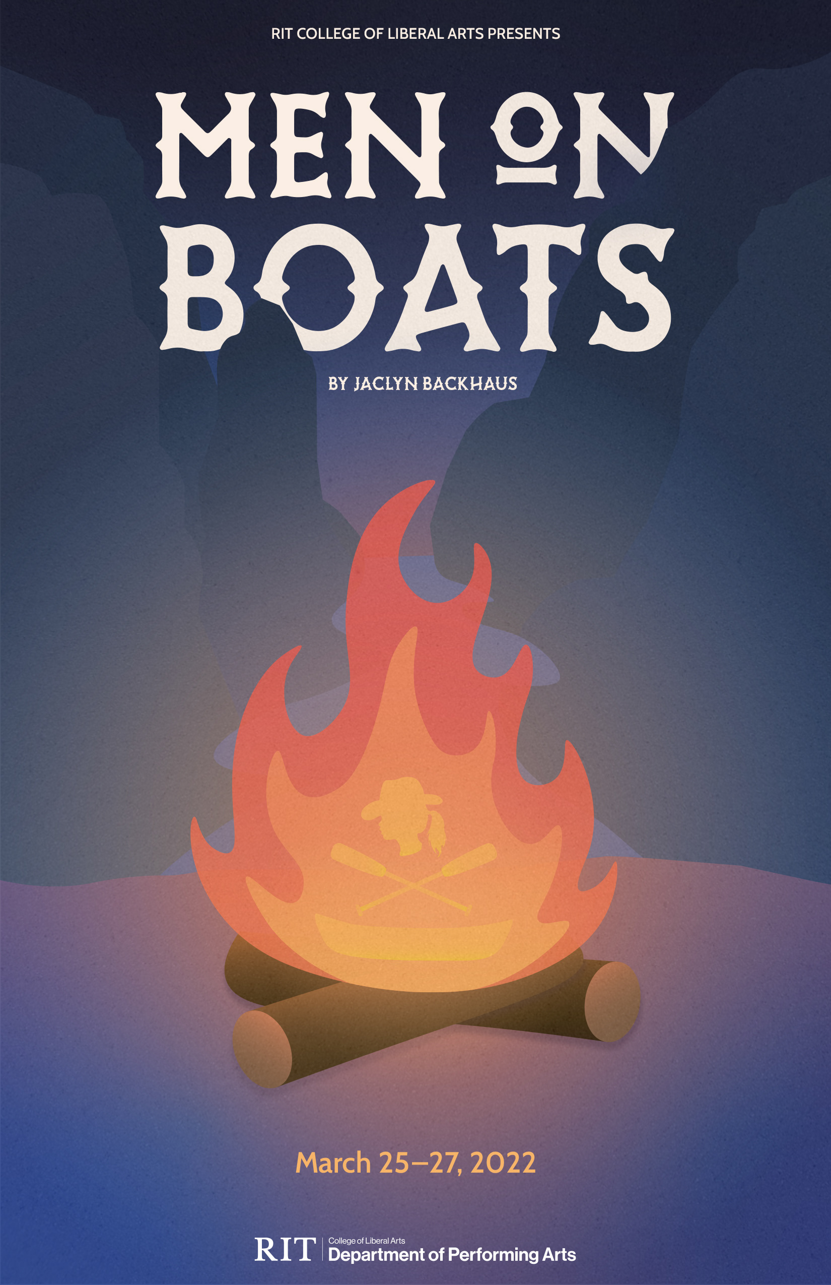
Playbill
Created using Adobe Illustrator, InDesign, and Photoshop